
We often assume that once we’ve invested in a solid set of RGBCW lights, we’ve checked the “color” box. We used to feel the same until gels worked their way back into our workflow. Digital LEDs give us speed and precision, but colored gels offer something different: a richer, more tactile mood that doesn’t always show up through a menu preset.
Over time, we’ve leaned on gels whenever we need warmth that doesn’t drift green or when we want a specific hue to stay consistent across shots. They’re lightweight, inexpensive, and expressive, which is why they’ve become a staple in our studio kit for both photo and video work.
Below, we’re sharing five gel techniques we use regularly in our studio that are simple, reliable lighting modifiers and setups that add depth, separation, and emotional tone without overpowering skin. If you’ve never worked with gels, these are the easiest ways to start.
Trick 1:Cinematic Rim Glow for Natural Separation
A rim glow is one of those tricks that quietly fixes half the problems in a small studio. When we place a small fixture behind the subject and angle it between 30° and 60°, the colored edge lift creates instant separation from the background. A warm gel gives a gentle halo; a cool gel adds shape and contrast.
How We Usually Set It Up
We start by softening the gelled light using a layer of diffusion. This keeps the glow smooth and avoids harsh transitions across hair or shoulders. When we want an even softer contour, we increase the distance or bounce the rim light into a small card.
Flags or grids help a lot, too. They keep the color off the lens and prevent spill from washing into the face, something that happens quickly when using stronger hues.
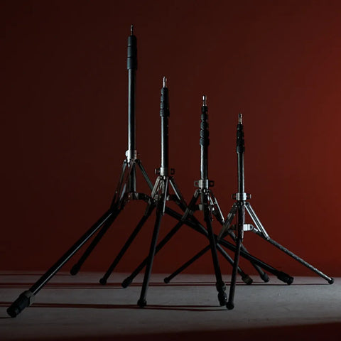
We secure the rim at precise angles using Harlowe’s light stands and mounting tools, which lock the fixture in place without adding bulk to the setup.
We’ve noticed that saturated red gels tend to shift brown on darker hair tones when angled incorrectly. Switching to an amber or peach gel brings back life without distorting the subject.
Trick 2: Two-Tone Portraits for Mood & Emotional Contrast
Two-tone setups are one of the easiest ways to introduce feeling into a frame. We use this when a neutral portrait feels too clinical or when we want a stylised look without heavy editing. Complementary pairings work best like teal and orange, lavender and peach, blue and warm white, though neighboring hues can create gentler moods.
How We Apply Two-Tone in Real Shoots
We keep our key light close to neutral so skin tone stays honest. The colored gel then shapes emotion from the fill or rim side. Our goal is subtlety: we’re building atmosphere, not painting the face.
When shooting creators with deeper skin tones, we’ve found that warm gels (peach, amber, rose) on the rim side add dimensionality without flattening undertones. Cool gels on the fill side, then add contrast without desaturating the complexion.
If the color starts overpowering the face, we slightly lower the gel intensity or move the fixture back. A small adjustment normally fixes the balance.
Trick 3: Gradient Background Wash for Easy Depth
When a background feels uninspired, our favorite trick is a gelled gradient. It turns a plain wall or seamless paper into an intentional design element.
How We Build Gradients
We place two lights behind or beside our subject, feathering them across the background at opposite angles. Using neighboring colors keeps the blend natural, as blue to teal, peach to rose, violet to blue.
Why It Works Well With Gels
Physical gels keep chroma consistent even when we dim the light, whereas some LEDs shift green or magenta at lower intensities. Gels retain the purity of the hue, which gives gradients a smooth, film-like quality.
This technique works beautifully for product videos, talking-head intros, and creator tutorials.
We often shape the background wash using Harlowe’s barndoors and grid modifiers, especially when we need the gradient to fall off cleanly.
Trick 4: Gelled Practical Enhancement for Realistic Scenes

Most sets include practicals like lamps, neon accents, screens, and small LEDs, and they rarely show up on camera as rich as they look in person. We use small gelled lights to “support” them.
How We Make Practicals Look Believable
We match the gel color to the practical’s hue, hide the small fixture just out of frame, and let the boosted glow spill into the environment. This keeps the original lamp intact while giving the room the ambience it’s meant to have.
A desaturated gel usually works best for realism. Strong gels can make practicals feel fake, but gentler tones blend with natural tungsten or LED bulbs seamlessly.
We typically hide the helper light using Harlowe’s compact cables and power accessories, which make it easier to rig small fixtures discreetly.
Mini Playbooks We Lean On in Real Shoots

Here are four quick, ready-to-use lighting recipes you can slot into any shoot for instant mood and depth:
Portrait Glow Setup
Neutral key, warm gelled rim, cool gel as fill. The combination adds curves and emotional contrast without distorting skin tones.
Product Accent Setup
Soft overhead, gelled kicker angled at packaging edges. Great for adding energy to labels or textures.
Atmospheric Layering Setup
Gradient background, subtle gobo pattern, neutral key. Adds depth on a small footprint.
Retro Film Look Setup
Warm key, cyan background gel, slightly reduced saturation in-camera. Mimics vintage palettes.
Lock these in once, and you’ll have dependable, cinematic looks ready whenever inspiration hits.
Shape Color With Intention
Working with gels has taught us that color isn’t just an accent; it’s storytelling. When we combine physical gels with digital RGBCW controls, we get the balance of precision and warmth that makes a scene feel handcrafted.
If you’re exploring color layering or refining your gel workflow, Harlowe’s best sellers offer a clean, neutral baseline to build from.


